Tuesday, August 31, 2010
Monday, August 30, 2010
Multimedia EXP: Community.
Our community includes local bands/musicians who all play rock music. By local, we mean the Kansas City metropolitan area.
Musicians/bands in this community have a few things in common. They all have personal and professional relationships. They understand each other’s needs and goals.
Everyone in this community desires a sense of well being. They all want to be safe and hope they can rely on others to give them tips on unsafe venues. They all also desire a sense of belonging. They need relationships in the field to compare and contrast their experiences.
Of course they all share a similar life goal, to become successful rock’n’roll musicians/bands and to share their musical talents with others who are interested.
People in the rock community want to have a choice whether or not to help other bands and musicians. They will want to put their band ahead of another band first, but then possibly share their experiences.
Finally, when it comes to their needs, people in this community constantly need material things, whether it is guitar strings or new speakers. They may need a way to get these things without sacrificing a lot of time or money.
Wednesday, August 25, 2010
Web 2.0:

Saturday, May 22, 2010


Friday, May 7, 2010


Sunday, May 2, 2010
Type in the Round: Process

My type experiment.
Amanda's type experiment.
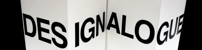
Type in the Round will focus on typography on multiple surfaces, ranging from packages to sculptures. We will concentrate on typography that uses dimensionality to convey a single or multiple messages and rely on artists and designers that think "outside of the page." The conference will encourage stubborn designers and artists to see their own work from a different point of view, and push typography to the EXTREME!!!!!!!!!
Logo type.
We wanted to focus on dimensionality for our logo.

We started by trying to create 3 dimensions by using Illustrator, but it did not look life-like.


Since our conference is based on dimensional typography, we thought it would make more sense to make our logo without using the computer.


Then we decided to add a secondary logo, to represent the 4 different professions that are invited to our conference.


We had trouble adding dimension to the circles. :(


