Wednesday, April 13, 2011
Sunday, April 10, 2011


Wednesday, March 30, 2011
Friday, March 18, 2011
info

Going 70mph:
1 minute = 1.1666 miles
1.1666 = 6159.648 feet
30 seconds = .583 miles
.583 miles = 3078 feet
Vertical clearance. Minimum vertical clearance under overhead structures (including over the paved shoulders) of 16 feet (4.88 m) in rural areas and 14 feet (4.27 m) in urban areas, with allowance for extra layers of pavement. Through urban areas at least one routing should have 16 feet (4.88 m) clearances. Sign supports and pedestrian overpasses must be at least 17 feet (5.18 m) above the road, except on urban routes with lesser clearance, where they should be at least 1 ft (0.3 m) higher than other objects.
Tunnel clearance. Tunnels should in theory be equivalent to long overcrossings, but because of cost the standards can be reduced. Vertical clearance is the same as under bridges, including the provision for alternate routing. Width should be at least 44 feet (13.41 m), which consists of two 12 feet (3.66 m) lanes, 10 feet (3.05 m) outside and 5 feet (1.52 m) inside shoulders, and 2.5 feet (0.76 m) safety walkways on each side. If necessary to meet the dimensions of the approach, this can be shifted left or right. A reduced width is acceptable due to high cost. In this case, the minimum width is 30 feet (9.14 m), with at least 2 feet (0.61 m) more than the approach for the sum of the shoulder widths, but at least 24 feet (7.32 m) total, and at least 1.5 feet (0.46 m) on each side for a safety walkway. If there is no safety walkway, a 3-foot (0.91 m) offset with a "safety shape" in the wall is acceptable.
Wednesday, March 2, 2011

Monday, February 28, 2011
Master Chief Monument
http://www.youtube.com/watch?v=NIwnrIOqhO8

http://halostory.bungie.org/halostory.timeline.html
Urban Awakening: Luke and Kate
Urban Awakening: Architecture for a Better Living
THE DESIGN OBJECTIVE
To reflect Le Corbusier’s entirely new way of living revolving around practicality, purpose, and functionality; breaking free from the crowded commotion of industriousness and reflecting back upon nature.
When we began this project, looking into the life of Corbusier and the reasoning behind his essay 5 Points Toward a New Architecture there were several ideas that resonated with us. One specifically was Corbusier’s idea, after World War I, of a backlash to all the destruction and killing, taking strong social consideration on making life better. In tandem with this idea, he was also influenced by the problems of industrial cities, their lack of moral landscape, overcrowding, and dirtiness; with the essay and its 5 Points, Corbusier envisioned creating not only harmony within the space but also harmony with nature. His idea that the roof garden simply replaces the ground the building was constructed upon further justifies this point, and this fusion of industry and nature is best resulted in the Villa Savoye. Demonstrating each of the 5 Points as well as providing a place to reflect back upon nature and break free from the hustle and bustle of industry.
This leads us the our exhibition, exemplifying the 5 Points in a persuasive manner that is both enlightening and practical. And from a grander standpoint we hope to have portrayed the ‘middle ground’ between the dirt of industry and the revitalization of nature through the practical breakdown of Corbusier’s argument reflecting upon freedom and the overall improvement of living.


Monday, February 7, 2011
Le corbusier
We decided on a direction to go, now we have to get working....
Taken from Luke's blog:
When approaching the branding / naming for our exhibition of Corbusier's 5 Points we decided to reflect back upon the essay trying to pull out key elements, thoughts, and expressions. This initial approach emphasizes expressing the essence of his thoughts in the essay, his utopian vision of the Villa Savoye and 'new architecture'.
IMAGERY + COLOR PALETTE here we have been working to gather imagery to inform the exhibition as well as to inspire the look&feel of the exhibit as well. Working with contrast and juxtaposition is also something Kate and I are considering at this point; and we are also looking to inform our color palette from imagery as well. My thoughts at this point are emphasizing the clean, smooth, and practical aesthetic Corbusier worked towards with the exaggeration of white, cool grays, and a warmer accent color.


Sunday, February 6, 2011
photos for inspiration


Space and light and order. Those are the things that men need just as much as they need bread or a place to sleep.
Le Corbusier
Saturday, February 5, 2011


Friday, February 4, 2011

Monday, January 31, 2011
H&R Block Space. Floor plan concept.


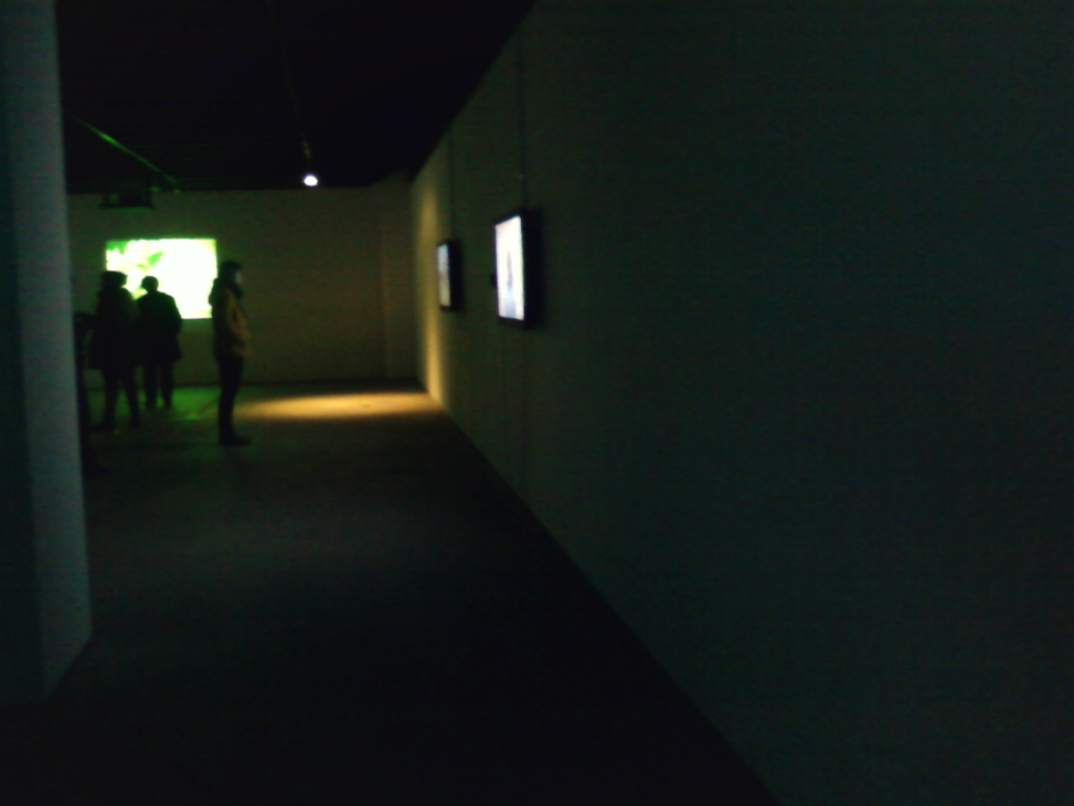
I know that I can no longer eliminate most of the walls. I planned on having the guests begin at the main entrance, then be lead to the left. When they enter, the movable walls will lead them around the bottom floor and into the rear stairwell. When they enter the second floor, they travel down a dark hallway, which then reveals the "rooftop" garden.
My narrative was about what the city looks like now. And what the city looked like before highways and skyscrapers were built. The garden, then, would be a reveal in the end.
Somehow we need to incorporate technology. My idea was to use their cellphones or another device to time how long the guests spend on a particular section, but at this point, i don't see how time would be relevant. Maybe we can use that idea, with the story and say that for every minute you spend... something happens to a baby seal... or something like that.
I need to keep in mind that the pelotes do not necessarily have to be thin, round columns.
We both need to find a way to use that spot number 8 on the second floor. what will the guests see when they look down?
I would appreciate any comments or questions..
Wednesday, January 26, 2011
degree.
For my degree project, I would like to answer, How can graphic design help young adults discover or rediscover themselves. I would like show that each person has their own individual personality and that they should not need to hide it. It would be useful for people to have a tool that would help them relate to other people, especially when they have to leave their nests and begin to develop their own selves. Friendships are more healthy when people accept each other's differences.
Subscribe to:
Comments (Atom)