Love: Then and Now
Love: Tradition, beauty and romance
Pick Apart Love
The Positives and Negatives of Love
Love: For Better or Worse
Monday, March 30, 2009
Thursday, March 26, 2009
Tuesday, March 24, 2009
icons as of Monday March 23rd


With the help of my classmates I've decided to take this route for my icons, although there still needs to be work done.
Adding a third color to the stroke alone isn't really helping it, so I'm going to try adding a really light fill to certain areas, similar to what i did in the 2 color icons below.


These were my first color ideas, but through a lot of trial and error only a few of my icons pull it off. I feel that the key, rose, and perfume bottle are working, but it's difficult to keep the same idea throughout all icons. First of all, the paper is flat, so there is really no where to add curves, the pen and the ring are skinny, so no matter where i add multiple colors they won't be visible in small form.
Inspiration for Licko and VanderLans poster
For my poster, I'm going to focus on experimental type, not necessarily creating my own fonts like zuzana licko and rudy vanderlans do, but placement, and variety are going to be extremely important. The good thing about these designers' style is they do something completely different with each Emigre cover. Hopefully i'll be able to combine some of these ideas into one poster.


Friday, March 13, 2009
notes: icon discussion with josh and logan
ring has empty space that nothing else does.
they like the overlap. :)
they like the red filled in icons
logan: take one of the colors and bump it up.
Josh: bring them down more.
I might try to change the black for the dark red, and go from there.
bottom work better in the handwriting-looking ones.
they like the overlap. :)
they like the red filled in icons
logan: take one of the colors and bump it up.
Josh: bring them down more.
I might try to change the black for the dark red, and go from there.
bottom work better in the handwriting-looking ones.
Monday, March 9, 2009
Friday, March 6, 2009
new color choices

The reds I chose have a romantic feel, they connote love, lust, beauty, kisses... overall romance.

The purples also have a beautiful, romantic feel.

The browns I originally had were muddy and seemed too nature-like, so I found a brown that looked more skin color, which has a different connotation.

This green does have a nature feel too it, but i feel that it's cleaner.
color crit.
Wednesday, March 4, 2009
crit notes:
type legibility. thicken up letters. try to integrate type w/ image.. don't just place it on there.
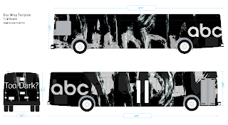
abc logo- fog can't see b.
think about mounting differently.
flash- make fog legible.. make dark legible.. it can be a little over 5 seconds...
some things are going too fast.
abc logo- fog can't see b.
think about mounting differently.
flash- make fog legible.. make dark legible.. it can be a little over 5 seconds...
some things are going too fast.
Monday, March 2, 2009
Notes: icon discussion in class
11- divided 2 + colors to positive space, divided into multiple shapes.
10-divided shapes by gaps, filling positive space.
9-outline, separated by gaps, positive form 2+ colors
8- outlined 2+ colors glares to show shape. divide icon into multiple forms to show shape
7-gap, adding background element, outline, observable gap.
6-all separate shapes, 2+ color, positive and negative, denote light and shape
5-denoting shape and light, not an outline, gaps!!! color added to positive and negative space
4- adding extra background element, filling positive space
3- adding color and motif to positive space,
2-adding 2+ colors to positive and negative, adding motif
Subscribe to:
Comments (Atom)


